
A new tool for exploration, visual communication and making sense of data. It is available for Mac, Windows and Linux.
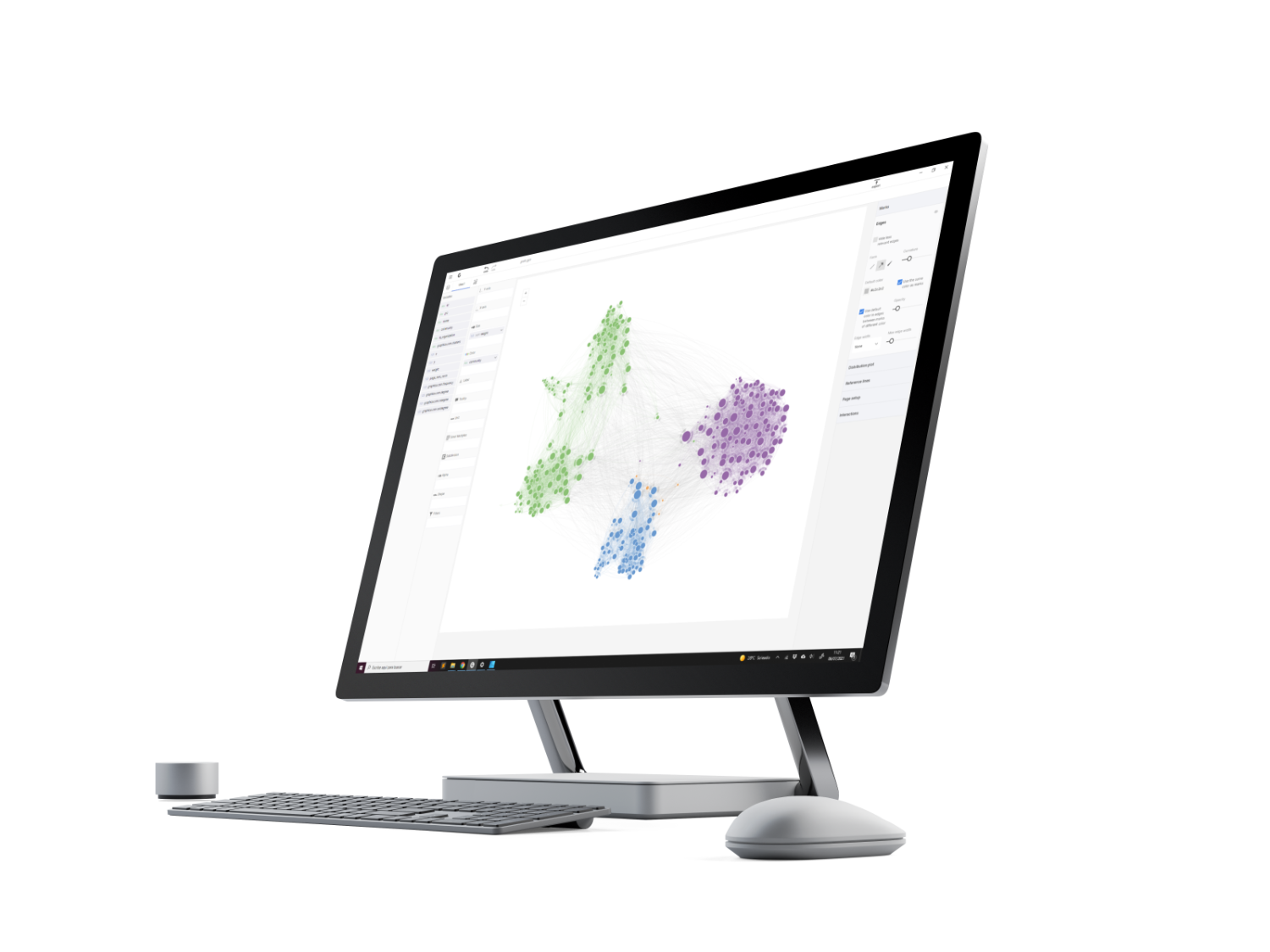
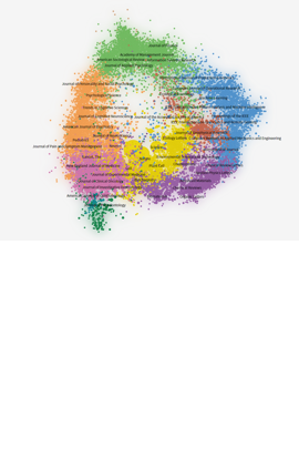
The Shape of Science is an information visualization project whose aim is to reveal the structure of science. Its interface has been designed to access the bibliometric indicators database of the SCImago Journal & Country Rank portal. The Shape of Science shows a very intuitive image of the interconnection of the different subject areas by the position of the journals. The individual profiles of the journals can be accessed from this interface.
Hassan-Montero, Y.; Guerrero-Bote, V.; Moya-Anegón, F. (2014). Graphical interface of the SCImago Journal and Country rank: an interactive approach to accessing bibliometric information. El profesional de la información, may-june, v. 23, n. 3, pp. 272-278.
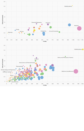
This tool enables you to build real time maps, bubble charts maps, according to your preferences. You can select a country and a period of two years between 1999 and 2017. At the top of the chart, there are a set of indicators available (Documents, Citable Documents, Cites, Self-Cites, Cites per Document, H Index, % Cited Documents), which you can select according to your preferences and make charts with three variables: x axis, y axis and z axis the size of bubbles.
You may choose between two types of maps: subject areas map and subject categories map. By clicking on one or more subject areas bubbles on the subject areas map you may filter subject categories. By placing the mouse on the bubbles you may view the complete name of the field and the underlying values for the chosen indicator for the axis z in that period.
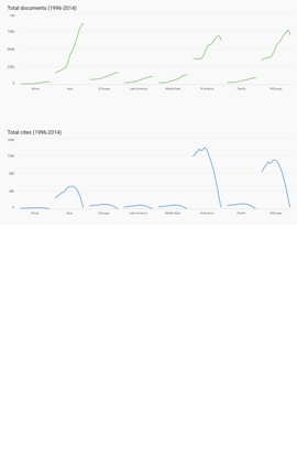
The world report offers detailed information for the analysis of the world and each of the eight large geographic regions. This page provides numerous indicators and displays tables and trend graphs (1996-2017) for all or one of the 27 major subject areas and for all or one of the regions matching the selected options. The indicators provided are: H Index, Documents, Citable Documents, Citations, Self-Citations and Citations per Document. The report also shows the evolution during the period 1996-2017 of Cited and Uncited Documents, Citable and Uncitable Documents, % Open Access and Non-Open Output, Citation, External and Self-Citation, Data by country (Documents, H Index and Citation per Document) and Documents by Subject Area. By placing the mouse on the charts you may view the underlying values.
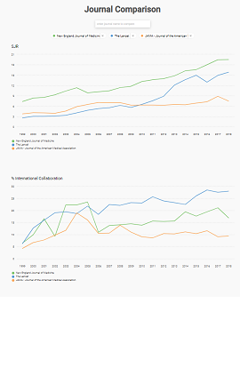
With this function, publications and countries can be analyzed comparatively using different indicators graphically represented. In fact, this function allows you to choose a total of up to 6 publications or countries from which a set of indicators that facilitate comparative analysis will be displayed. The indicators shown in the comparison are part of those that appear when accessing the individual registries of publications and countries.
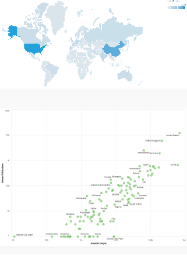
This tool shows the distribution of indexed publications (based on country of the publisher) and of scientific output by countries (based on the country of affiliation of the authors) in a georeferenced form or to analyze the relationship between both values. This relationship shows how it tends to be true that those countries that have more journals indexed in the Scopus database have more scientific output. The tool allows to filter by dates, world regions and subject areas.
 Powered by:
Follow us on @ScimagoJR
Scimago Lab, Copyright 2007-2025. Data Source: Scopus®
